CSS 基础 – 长度单位
在 CSS 中,长度单位:主要分为绝对长度单位和相对长度单位。
绝对长度单位:代表一个物理测量
像素px(pixels)
// 在web上,像素px是典型的度量单位,很多其他长度单位直接映射成像素。最终,他们被按照像素处理

英寸     in(inches)              1in = 2.54cm = 96px
厘米     cm(centimeters)         1cm = 10mm = 96px/2.54 = 37.8px
毫米     mm(millimeters)         1mm = 0.1cm = 3.78px
1/4毫米  q(quarter-millimeters)  1q = 1/4mm = 0.945px
点       pt(points)              1pt = 1/72in = =0.0139in = 1/722.54cm = 1/7296px = 1.33px
派卡     pc(picas)               1pc = 12pt = 1/6in = 1/6*96px = 16px
相对长度单位 - 字体相关:em、ex、ch、rem
[1] em:表示元素的 font-size 属性的计算值
如果用于font-size属性本身,相对于父元素的font-size;若用于其他属性,相对于本身元素的font-size。
<style>
.box{font-size: 20px;}
.in{
    /* 相对于父元素,所以2*2px=40px */
    font-size: 2em;
    /* 相对于本身元素,所以5*40px=200px */
    height: 5em;
    /* 10*40px=400px */
    width: 10em;
    background-color: lightblue;
}
</style>
<div class="box"> <div class="in">测试文字</div> </div>
[2] rem:相对于根元素 html 的 font-size 属性的计算值 // 兼容性: IE8-不支持
<style>
/* 浏览器默认字体大小为16px,则2*16=32px,所以根元素字体大小为32px */
html{font-size: 2rem;}
/* 2*32=64px */
.box{font-size: 2rem;}
.in{
    /* 1*32=32px */
    font-size: 1rem;
    /* 1*32=32px */
    border-left: 1rem solid black;
    /* 4*32=128px */
    height: 4rem;
    /* 6*32=192px */
    width: 6rem;
    background-color: lightblue;
}
</style>
<div class="box"> <div class="in" id="test">测试文字</div> </div>
默认地,浏览器的字体大小 font-size 是 16px,也就是 1rem=16px。通常会将 HTML 的 font-size 设置为 100px,方便后续计算,不设置为 10px 是因为: chrome 下最小字体大小为 12px。
[3] ex:指所用字体中小写 x 的高度,但不同字体 x 的高度可能不同。
实际上,很多浏览器取 em 值一半作为 ex 值。在开发中,ex 常用于微调。
<style>
.box{font-size: 20px;}
.in{
    font-size: 1ex;
    border-left: 1ex solid black;
    height: 10ex;
    width: 20ex;
    background-color: lightblue;
}
</style>
<button>宋体</button><button>微软雅黑</button><button>arial</button><button>serif</button> <div class="box"> <div class="in" id="test">测试文字</div> </div><script> var aBtns = document.getElementsByTagName('button'); for(var i = 0; i < aBtns.length; i++ ){ aBtns[i].onclick = function(){ test.style.fontFamily = this.innerHTML; } } </script>
[4] ch:与ex类似,被定义为数字 0 的宽度。当无法确定数字 0 宽度时,取 em 值的一半作为 ch 值
ch 在实际中主要用于盲文排版,且兼容性: IE8-不支持
<style>
.box{font-size: 20px;}
.in{
    font-size: 1ch;
    border-left: 1ch solid black;
    height: 10ch;
    width: 20ch;
    background-color: lightblue;
}
</style>
<button>宋体</button><button>微软雅黑</button><button>arial</button><button>serif</button> <div class="box"> <div class="in" id="test">测试文字</div> </div><script> var aBtns = document.getElementsByTagName('button'); for(var i = 0; i < aBtns.length; i++ ){ aBtns[i].onclick = function(){ test.style.fontFamily = this.innerHTML; } } </script>
相对长度单位 - 视口相关
视口相关的长度值相对于初始包含块的大小。当初始包含块的宽高变化时,他们都会相应地缩放。然而,当根元素的 overflow 值为 auto 时,任何滚动条会假定不存在。关于视口相关的单位有 vh、vw、vmin、vmax 4个单位。
兼容性:IE8-、IOS7.1-、android4.3- 不支持(对于 vmax,所有 IE 都不支持)。另,黑莓错误的将其相对于视觉视口来计算;而 safari 奇怪地相对于 html 元素来计算,如果 html 中增加了内容,这两个单位也会发生变化。
[1] vh:布局视口高度的 1/100
[2] vw:布局视口宽度的 1/100
<style>
body{margin: 0;}
.box{
    /* 实现与屏幕等高的效果 */
    height: 100vh;
    background-color: lightblue;
}
</style>
<div class="box"></div>
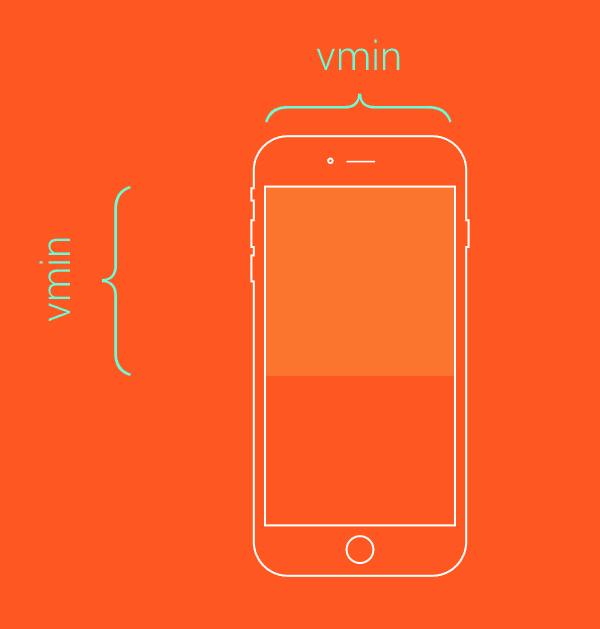
[3] vmin:布局视口高度和宽度之间的最小值的 1/100
/*类似于contain效果*/
.box{
    height: 100vmin;
    width: 100vmin;
}
[4] vmax:布局视口高度和宽度之间的最大值的 1/100
/*类似于cover效果*/
.box{
    height: 100vmax;
    width: 100vmax;
}

数学表达式 calc()
数学表达式 calc() 是 CSS 中的函数,主要用于数学运算。使用 calc(),为页面元素布局提供了便利和新的思路。
[1] 定义:calculate 的缩写,它允许使用+、-、*、/ 四种运算符,可以混合使用 %、px、em、rem 等单位进行计算。
需要注意的是,+和-运算符两边一定要有空白符。另,兼容性: IE8-、safari5.1-、ios5.1-、android4.3-不支持,android4.4-4.4.4只支持加法和减法。IE9不支持用于backround-position。
<style>
.test1{
    border: calc( 1px + 1px ) solid black;
    /* calc里面的运算遵循*、/优先于+、-的顺序 */
    width: calc(100%/3 - 2*1em - 2*1px);
    background-color: pink;
    font-style: toggle(italic, normal);
}
.test2{
    /* 由于运算符+的左右两侧没有空白符,所以失效 */
    border: calc(1px+1px) solid black;
    /* 对于,不能小于0的属性值,当运算结果小于0时,按0处理 */
    width: calc(10px - 20px);
    padding-left: 10px;
    background-color: lightblue;
}
</style>
<div class="test1">测试文字一</div>
<div class="test2">测试文字二</div>
[2] 应用:数学表达式 calc(),常用于布局中的不同单位的数字运算。
<style>
p{margin: 0;}
.parent{overflow: hidden;zoom: 1;}
.left{float: left;width: 100px;margin-right: 20px;}
.right{float: left;width: calc(100% - 120px);}
</style>
<div class="parent" style="background-color: lightgrey;">
    <div class="left" style="background-color: lightblue;">
        <p>left</p>
    </div>
    <div class="right"  style="background-color: lightgreen;">
        <p>right</p>
        <p>right</p>
    </div>
</div>