全屏布局
了解 CSS 中属性的值及其特性, 透彻分析问题和需求才可以选择和设计最适合的布局解决方案。
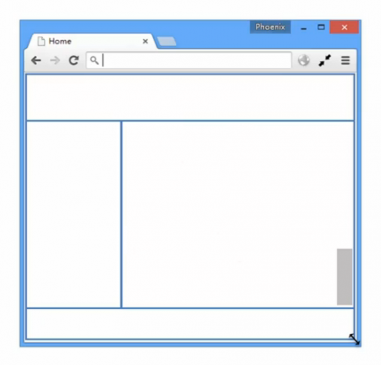
[ 全屏布局的特点 ] 例如,管理系统、监控与统计平台,均广泛的使用全屏布局。
- 滚动条不是全局滚动条,而是出现在内容区域里,往往是主内容区域
- 浏览器变大时,撑满窗口
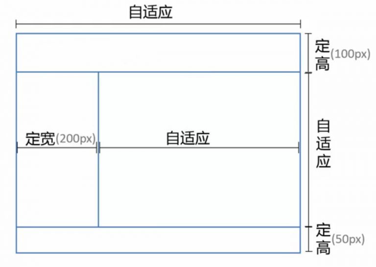
定宽需求
[1] position
[ 原理 ]将上下部分固定,中间部分使用定宽+自适应+两块高度一样高
<div class="parent">
  <div class="top"></div>
  <div class="left"></div>
  <div class="right">
    /*辅助结构用于滚动*/
    <div class="inner"></div>
  </div>
  <div class="bottom"></div>
</div>
<style>
  html,
  body,
  .parent {
    height: 100%;
    /*用于隐藏滚动条*/
    overflo: hidden;
  }
  .top {
    /*相对于 body 定位*/
    position: absolute;
    top: 0;
    left: 0;
    right: 0;
    height: 100px;
  }
  .left {
    position: absolute;
    left: 0;
    top: 100px;
    bottom: 50px;
    width: 200px;
  }
  .right {
    position: absolute;
    left: 200px;
    right: 0;
    top: 100px;
    bottom: 50px;
    overflow: auto;
  }
  .right .inner {
    /*此样式为演示所有*/
    min-height: 1000px;
  }
  .bottom {
    position: absolute;
    left: 0;
    right: 0;
    bottom: 0;
    height: 50px;
  }
</style>

// 优缺点:兼容性好,ie6下不支持
[ position 兼容 ] 此方法不支持 IE6 ,可以使用下面的方法解决兼容问题。
<div class="g-hd"></div>
<div class="g-sd"></div>
<div class="g-mn"></div>
<div class="g-ft"></div>
<style>
  html,
  body {
    width: 100%;
    height: 100%;
    overflow: hidden;
    margin: 0;
  }

  html {
    _height: auto;
    _padding: 100px 0 50px;
  }

  .g-hd,
  .g-sd,
  .g-mn,
  .g-ft {
    position: absolute;
    left: 0;
  }

  .g-hd,
  .g-ft {
    width: 100%;
  }

  .g-sd,
  .g-mn {
    top: 100px;
    bottom: 50px;
    _height: 100%;
    overflow: auto;
  }

  .g-hd {
    top: 0;
    height: 100px;
  }

  .g-sd {
    width: 300px;
  }

  .g-mn {
    _position: relative;
    left: 300px;
    right: 0;
    _top: 0;
    _left: 0;
    _margin-left: 300px;
  }

  .g-ft {
    bottom: 0;
    height: 50px;
  }
</style>
[2] Flex
[ 原理 ] 通过灵活使用CSS3布局利器flex中的flex属性和flex-direction属性以达到全屏布局。
<div class="parent">
  <div class="top"></div>
  <div class="middle">
    <div class="left"></div>
    <div class="right">
      <div class="inner"></div>
    </div>
  </div>
  <div class="bottom"></div>
</div>
<style media="screen">
  html,
  body,
  parent {
    height: 100%;
    overflow: hidden;
  }

  .parent {
    display: flex;
    flex-direction: column;
  }

  .top {
    height: 100px;
  }

  .bottom {
    height: 50px;
  }

  .middle {
    // 居中自适应
    flex: 1;
    display: flex;
    /*flex-direction: row 为默认值*/
  }

  .left {
    width: 200px;
  }

  .right {
    flex: 1;
    overflow: auto;
  }
  .right .inner {
    min-height: 1000px;
  }
</style>

// 优缺点:兼容性差,ie9及ie9以下不兼容
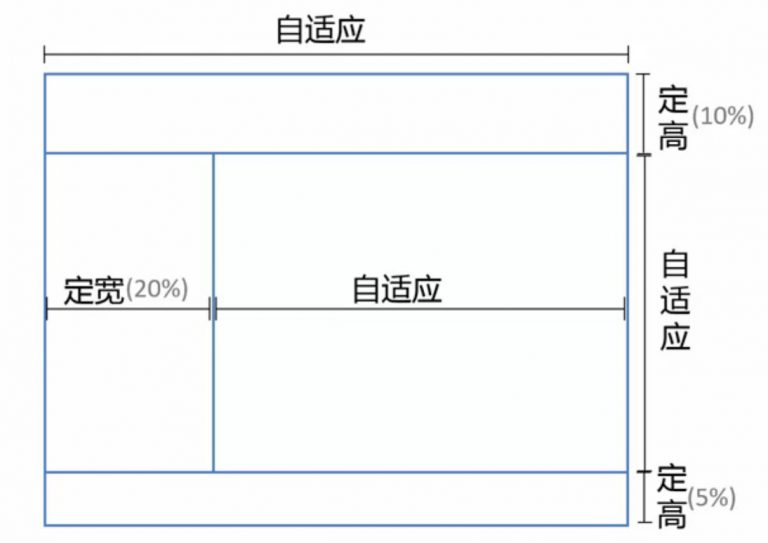
百分比宽度需求
[ 原理及用法 ]只需把定宽高(
px为单位的值)的实现改成百分比(%)既可。
内容自适应
只有右侧栏占据剩余位置,其余空间均需根据内容改变。 所以 Postion 的定位方法不适合实现此方案。

[ Flex ] 只有不为宽高做出限制,既可对其中的内容做出自适应的布局。
<div class="parent">
  <div class="top"></div>
  <div class="middle">
    <div class="left"></div>
    <div class="right">
      <div class="inner"></div>
    </div>
  </div>
  <div class="bottom"></div>
</div>

<style media="screen">
  html,
  body,
  parent {
    height: 100%;
    overflow: hidden;
  }

  .parent {
    display: flex;
    flex-direction: column;
  }

  .middle {
    // 居中自适应
    flex: 1;
    display: flex;
    /*flex-direction: row 为默认值*/
  }

  .right {
    flex: 1;
    overflow: auto;
  }
  .right .inner {
    min-height: 1000px;
  }
</style>